Flake Epoxy Floor Colors & Custom Blend Ideas
Compare flake color families, explore blend ideas, and help customers picture the options in their own garage.
Help Customers Picture the Overall Look
Good to Know
Start with the room photo, compare a shortlist, and confirm the chosen finish with a physical sample.
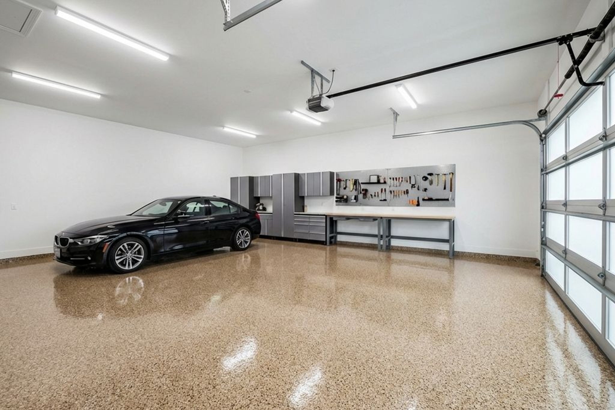
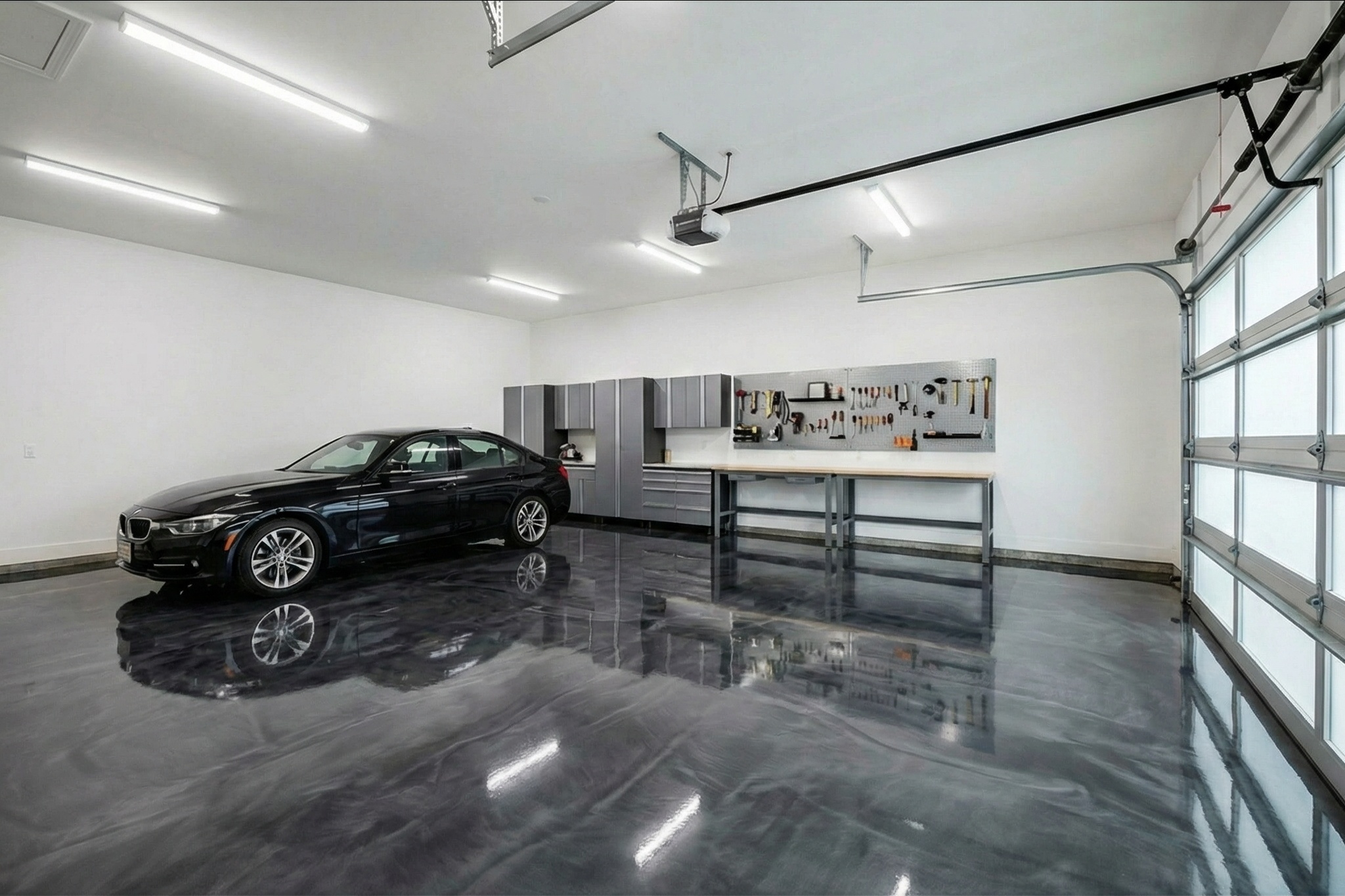
Choosing a flake color is part of choosing how the whole garage will feel. Ask what the customer wants the floor to work with: wall color, cabinets, vehicles, or an adjoining room.
A physical sample shows the blend up close. A room preview helps customers discuss its overall color and contrast across the floor. Use both when narrowing the choices.

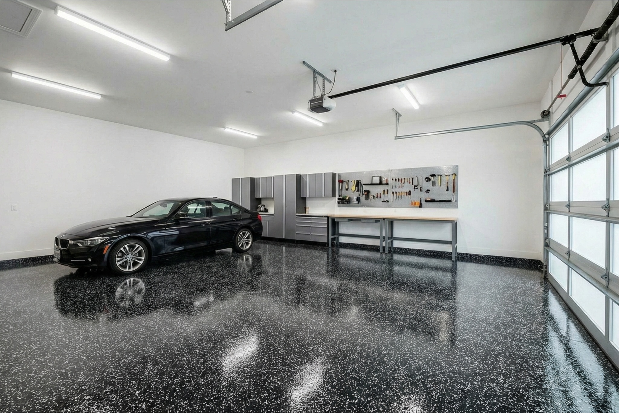
Keep the comparison focused on the finishes the customer is considering. Share the previews so another decision-maker can join the conversation without starting from a full color chart.
Pro Tip
Start with the colors already in the space, then compare a small shortlist of blends. Ask what the customer likes about each option before adding another.
Compare Flake Color Families
Use color families to narrow the choices before comparing individual blends. Start with the walls, cabinetry, and the amount of contrast the customer wants, then review physical samples from your supplier.
Flake color families and starting points for comparison
| Color Family | Top Blends | Best Base Coat | Sweet Spot |
|---|---|---|---|
| Gray Scale | Domino, Smoke, Pewter | Charcoal or Medium Gray | Standard garages, modern homes |
| Earth Tones | Saddle Tan, Outback, Autumn | Tan or Chocolate Brown | Warm interiors, wood cabinetry |
| Blue Blends | Orbit, Ocean, Nightfall | Navy or Dark Gray | Pool houses, coastal styles |
| Bold / Multi-Color | Rainbow, Cabin Fever, Carnival | Black or Dark Gray | Showroom garages, rec rooms |
| White / Light | Arctic, Cloud, Glacier | White or Light Gray | Showrooms, retail, salons |
Gray Scale Blends: The Bread and Butter
Compare light, medium, and dark gray blends against the garage walls and cabinetry. A neutral palette can still vary considerably in contrast; show the overall look in the room and confirm it with the sample.
Domino, Smoke, and Pewter offer different directions within a gray palette. Check the current supplier sample for the blend you are quoting; similar names do not establish an identical mix.
Earth Tones: The Warm Alternative
Compare blends such as Saddle Tan and Outback when the customer wants a warmer floor. Look at the sample beside wood cabinetry, brick, or other warm finishes in the space.
Bold Blends: The Portfolio Builders
For a customer who wants more color, compare a multi-color blend alongside a neutral option. Use the room preview to discuss how prominent the floor should feel, then confirm the chosen blend with a supplier sample.
Margin Insight
Quote the actual product and installation scope. Check supplier pricing and application requirements before treating a different blend as an upgrade.
Flake Size and Density: The Technical Side of Color
Color is only half the equation. The size of the flake and how much of it you put down change the look of the finished floor as much as the blend itself. A Domino blend at 1/4" full broadcast looks completely different from Domino at 1/8" partial broadcast. Same colors, different floor.
Flake Size Comparison
| Spec | 1/4" Flake | 1/8" Flake |
|---|---|---|
| Look | Speckled, textured, visible chip shapes | Fine, uniform, almost granite-like |
| Slip Resistance | Higher (more texture) | Moderate |
| Full Broadcast Coverage | ~20 lbs per 100 sq ft | ~50 lbs per 100 sq ft |
| Partial Broadcast | ~8-12 lbs per 100 sq ft | ~15-20 lbs per 100 sq ft |
| Material Cost (40 lb box) | $70-120 | $80-140 |
| Area per Box (full broadcast) | ~200-250 sq ft | ~80-100 sq ft |
| Best For | Garages, basements, workshops | Retail, offices, commercial lobbies |
| Ease of Application | Easier to achieve even coverage | Requires more skill and more product |
Full Broadcast vs. Partial: A Decision That Changes Everything
Full broadcast (also called "broadcast to rejection") means you throw flake until the base coat is completely covered and cannot accept any more. You literally cannot see the base coat underneath. The floor surface is 100% chip texture. Partial broadcast means you scatter flake decoratively so the base coat color shows through between the chips.
Full Broadcast vs. Partial
Pros
- Full broadcast hides every crack, patch, and imperfection in the concrete
- Full broadcast lasts 15-20 years because the flake layer adds physical thickness
- Full broadcast provides better slip resistance due to heavier texture
- Full broadcast looks professional and finished from every angle
Cons
- Full broadcast uses 2-3x more flake material than partial ($150-300 more per garage)
- Full broadcast requires faster work pace since all flake must land in wet epoxy
- Partial broadcast costs less and still looks good for budget-conscious clients
- Partial broadcast lets the base coat color influence the overall appearance
Pro Tip
Always quote full broadcast as the default and offer partial as the value alternative. Full broadcast costs you $150-300 more in material on a standard garage but commands a $1-2/sq ft price premium. On a 450 sq ft floor, that is $450-900 more revenue for an extra $200 in chips. The math is obvious.
Material Planning by the Numbers
- 1Measure the floor area in square feet. Standard 2-car garage: 400-500 sq ft.
- 2For 1/4" full broadcast: order 20 lbs per 100 sq ft. A 450 sq ft garage needs 90 lbs, so three 40 lb boxes with some left over.
- 3For 1/4" partial broadcast (medium scatter): order 10 lbs per 100 sq ft. Same garage needs 45 lbs, so two 40 lb boxes.
- 4For 1/8" full broadcast: order 50 lbs per 100 sq ft. A 450 sq ft garage needs 225 lbs, which is six 40 lb boxes.
- 5Always order 10-15% extra. Running out of flake mid-broadcast means visible seams where you had to stop and restart.
Base Coat Pairing: The Color Under the Color
For full broadcast, the base coat color is irrelevant. You will never see it. For partial broadcast and medium-density scatters, the base coat is the background canvas that the flake sits on. A mismatched base coat makes even a good blend look off. A well-matched base coat makes a simple blend look intentional and polished.
The rule is straightforward. Match the base coat to the dominant color in your flake blend. Domino has black, granite, and white chips. A charcoal or medium gray base coat ties it together. Outback has browns, tans, and salmon. A tan or mocha base coat works. Orbit has blue, gray, and white. A dark gray or navy base pulls it together.
Base Coat Pairing Guide
| Flake Blend Type | Recommended Base | Avoid | Why It Works |
|---|---|---|---|
| Gray blends (Domino, Smoke) | Charcoal or Medium Gray | White (too much contrast) | Gray base blends with the dominant chip color so gaps between flakes disappear |
| Earth tones (Saddle Tan, Outback) | Tan, Mocha, or Chocolate | Gray (creates a cold disconnect) | Warm base reinforces the warm palette of the blend |
| Blue blends (Orbit, Nightfall) | Navy or Dark Gray | White or Tan (clashes) | Dark base adds depth behind blue and white chips |
| Bold multi-color (Rainbow, Carnival) | Black | Any light color (chips look scattered) | Black base gives bold colors maximum pop and visual weight |
| White / Light (Arctic, Glacier) | White or Off-White | Dark gray or black (harsh contrast) | Light base keeps the floor feeling clean and airy |
Warning
The most common base coat mistake: using white or light gray under a dark blend at partial broadcast density. The bright base coat glares through the gaps between chips and makes the floor look unfinished. If the client wants partial broadcast, the base coat color is just as important as the blend itself.
Some contractors skip tinted base coats entirely and use clear epoxy. This is a mistake on partial broadcast jobs because the raw concrete color shows through. Concrete color varies across the slab, especially in garages with oil stains, patches, and moisture marks. A tinted base coat evens that out and gives you a uniform canvas.
Creating Custom Blends That Stand Out
Pre-blended colors from Torginol and other suppliers cover most jobs. But custom blends separate your business from every other installer in your market. When a competitor offers the same Domino and Saddle Tan that everyone else stocks, you offer exclusive color collections with names that belong to your brand.
How to Build a Custom Blend
Start with two anchor colors
Pick one dark and one light. Black and white is the simplest starting point. Dark brown and cream. Navy and silver. These two colors create the visual range of your blend.
Add one or two accent colors
The accent is what gives the blend its personality. Salmon turns a brown-and-tan blend into something that reads as sandstone. A touch of blue turns a gray blend into something coastal. Keep accents to 10-20% of the total mix. More than that and the blend gets busy.
Test ratios on a sample board
Grab a 2x2 foot piece of melamine or primed plywood. Brush on your base coat color, broadcast a small handful of your test blend, and let it cure. This 15-minute test saves you from installing 450 sq ft of a blend the client rejects.
Order in bulk once proven
Buy individual solid-color flake in 40 lb boxes and mix your own ratios. A 4-color custom blend using Torginol solid colors costs roughly the same as buying a pre-blended color. The markup to the customer is where the money is.
Naming Your Exclusive Blends
A blend called "Custom Gray #3" does not sell. A blend called "Thunderstorm" or "Sierra Ridge" does. Names create perceived value. When a homeowner picks "Sierra Ridge" they feel like they chose something curated, not generic. Some contractors name blends after local landmarks or neighborhoods. "Lakewood Granite" for a gray blend. "Mesa Sunset" for a warm earth tone. It roots your brand in the community and makes the product feel exclusive.
- Gray blends: Thunderstorm, Iron Ridge, Silver Fox, Glacier Point, Aspen Gray
- Earth tones: Sierra Ridge, Canyon Floor, Desert Stone, Autumn Trail, Copper Creek
- Blue blends: Deep Water, Coastal Drift, Midnight Harbor, Pacific Edge
- Bold blends: Electric Garage, Pit Lane, Summit, Firehouse, Velocity
Margin Insight
Exclusive named blends let you charge $0.50-1.00/sq ft more than standard catalog colors. The material cost is identical. You are selling the brand and the curation. On a 450 sq ft garage, that is $225-450 in pure margin from a naming strategy that costs nothing to implement.
Mixing Ratios That Work
Three and four color blends produce the best results. Two colors look flat. Five or more colors get muddy and lose definition at a distance. Here are proven starting ratios you can adjust to taste.
- 3-color neutral: 40% medium gray, 35% black, 25% white. Clean, balanced, reads well in any lighting.
- 3-color warm: 40% tan, 35% brown, 25% cream. Sandstone look without the red tones that some clients find too bold.
- 4-color signature: 30% black, 25% medium gray, 25% white, 20% accent (blue, copper, or green). The accent color at 20% is visible but does not overwhelm.
- 4-color earth: 30% brown, 25% tan, 25% salmon, 20% white. The Outback formula rearranged. Salmon is the secret ingredient that gives earth blends warmth.
Color Trends for 2026: What Is Selling Right Now
Color trends in epoxy flake shift slowly. This is not fashion where everything changes every season. Gray has been the top seller for a decade and that is not changing. But within the categories, there are real movements worth tracking because they affect what you stock, what you recommend, and what you photograph for your portfolio.
The Big Shifts
- Warm grays are overtaking cool grays. Pure blue-undertone grays like Smoke are giving way to "greige" blends that mix gray with warm taupe or tan accents. Sherwin-Williams calls this trend "modern warmth."
- Nature-inspired blends are up. Forest floor browns, weathered stone grays, living moss green accents. Homeowners are asking for floors that feel organic rather than industrial.
- Full broadcast is becoming the default. Two years ago, partial broadcast was the volume play. Now full broadcast is expected on professional installs. Homeowners see full-coverage floors on Instagram and Pinterest and assume that is the standard.
- Metallic flake accents are new. A few suppliers now offer metallic vinyl chips that you can mix into standard blends at 5-10% ratios. The metallic chips catch light and add depth without the complexity of a full metallic system.
Regional Preferences
Regional Color Preferences (2026)
| Region | Dominant Colors | Rising Trend | Notes |
|---|---|---|---|
| Northeast | Domino, Pewter, Granite | Warm greige blends | Conservative. Gray dominance strongest here. |
| Southeast | Saddle Tan, Outback, Sand | Coastal blue accents | Earth tones outsell gray in FL, GA, SC. |
| Southwest | Desert Stone, Copper Creek, Tan | Terracotta accents | Earth tones dominant. Very few cool grays sold. |
| Midwest | Domino, Smoke, Gray Granite | Quartz-flake hybrids | Gray-heavy market. Durability sells over style. |
| West Coast | Modern Gray, White/Light | Bold multi-color, metallic chips | Most design-forward. Early adopters of new blends. |
| Pacific NW | Forest tones, Slate, Moss | Green-tinted grays | Nature-inspired palette fits the regional aesthetic. |
Good to Know
Zillow reported a sharp rise in "color-drenched" home listings in 2026, with floors, walls, and trim working together in a cohesive palette. For coating contractors, this means the floor color conversation is expanding. Homeowners are not just picking a garage floor color. They are asking how it fits with their house. Be ready to talk about trim, cabinetry, and wall colors, not just chip cards.
Seven Color Mistakes That Cost You Jobs and Callbacks
Color mistakes do not just look bad. They cost you money. A homeowner who dislikes the color on day one will never refer you, even if the floor is technically perfect. And a blend that looks wrong because of a bad base coat or wrong density means a callback, a redo, or a bad review. Here are the seven mistakes that show up most often.
1. Too Many Colors in the Blend
Five or six colors in a flake blend look great in a handful. Spread across 450 square feet, they turn into visual noise. The eye cannot pick out individual colors at a distance, so the floor just looks busy and confused. Three to four colors is the sweet spot. It provides enough visual interest without losing definition.
2. Wrong Density for the Space
Partial broadcast in a garage with oil stains, crack repairs, and concrete patches looks cheap. The base coat shows through, and every imperfection is visible between the chips. If the slab has flaws, go full broadcast. Save partial broadcast for newer, cleaner concrete where the base coat color adds to the look instead of detracting from it.
3. Mismatched Base Coat
A white base coat under a dark flake blend at partial density creates a floor that looks like someone spilled chips on a white countertop. The contrast is jarring. Match the base coat to the dominant chip color. If you are not sure, go one shade darker than you think you need.
4. Relying on Sample Chips Instead of Visualizations
A 2-inch chip sample under showroom lighting tells you almost nothing about how that blend looks on a real floor under real lighting. Colors shift dramatically at scale. Warm tones read warmer. Cool tones read cooler. Subtle accents disappear entirely. Show clients a full-floor visualization or at minimum a 2x2 foot sample board with base coat and flake applied at the actual density you plan to use.
5. Ignoring the Surroundings
A warm Saddle Tan floor in a garage with cool blue-gray walls and white metal shelving looks disconnected. The floor color needs to work with the walls, trim, cabinetry, and the exterior of the house. Walk the space with the client before recommending a blend. Look at what is already there and recommend colors that complement it.
6. Uneven Broadcast Distribution
Clumps of heavy flake next to sparse patches create a splotchy floor. This is a technique issue, not a color issue, but it affects how the color reads. Practice your broadcast motion: consistent arm speed, overlapping passes, and work from the back of the room forward so you are not walking through wet flake. On larger floors, have a second person broadcasting while you roll the base coat to maintain a wet edge.
7. Mixing Different Flake Batches Mid-Job
Flake colors can vary slightly between production batches and between manufacturers. Two boxes of "black" from different lots might not match exactly. If you are running a custom blend, pre-mix all your flake in a large container before you start broadcasting. Dump all your boxes together, mix thoroughly, and broadcast from the combined batch. This eliminates color shifts across the floor.
Warning
If you add flake from a different batch or brand mid-broadcast, the color transition will be visible. The line where the old batch ends and the new batch begins shows through the topcoat. Pre-mix everything before you open the base coat bucket.
Help Customers Compare Flake Colors
Their room
See the Blend in Context
Compare the preview with the actual space
Their shortlist
Discuss the Overall Look
Confirm the finish with a physical sample
One reference
Share the Floor Preview
Give decision-makers the same options to discuss
A customer may like a flake sample but still struggle to picture it across the garage. A room preview gives you something specific to discuss: the overall color, contrast, and pattern in their space.
Upload a photo of the garage and create previews of the blends the customer is considering. Compare them together and share the shortlist so anyone who missed the estimate can join the decision.
Compare a Focused Shortlist
Start with their preference
Preview a blend the customer likes on the garage photo. Ask what they like about the color and contrast.
Show a useful alternative
Compare a lighter, darker, warmer, or cooler blend in the same space. Keep the difference easy to discuss.
Confirm the shortlist
If the customer wants another direction, preview it. Review the physical samples before settling on the finish.
A preview helps set expectations about the overall look; it does not guarantee the installed color or pattern. Confirm the blend and finish with a physical sample, and explain how lighting, application, and the topcoat can affect the result.
Pro Tip
Keep the selected product name with the preview and proposal so everyone can refer to the same finish during follow-up.
Featured Materials
Gray Scale
Domino Flake
The #1 seller. Black, granite, and white in equal thirds. Works on every home style from ranch to modern.
Earth Tone
Saddle Tan
Warm brown and tan blend that pairs with wood cabinetry. Top seller in the Southeast and Southwest.
Earth Tone
Outback
Six-color blend: autumn brown, black, brown, salmon, tan, and white. Reads like natural sandstone at full broadcast.
Gray Scale
Smoke
Light gray dominant with subtle dark accents. Softer and brighter than Domino. Popular in modern white-walled garages.
Blue Blend
Nightfall
Deep navy, gray, and white chips. Moody and distinctive. Strong seller for basements and pool houses.
Blue Blend
Orbit
25% black, 25% medium gray, 25% true blue, 25% white. The best-selling blue blend on the market.
Show Every Blend in Their Actual Space
Upload a garage photo, pick a flake blend, and generate a photorealistic visualization, then send a proposal that makes the color decision easy.